Tip #1709 – Using dynaMACS’ Sales IQ Graph to Show the difference in “House” Commission percentages for this year versus last year
In our previous tip #1708 we talked about using dynaMACS’ Sales IQ to analyze “House” commission. The following will show you how to create a graph from that information.
Using the Graphing Feature in dynaMACS
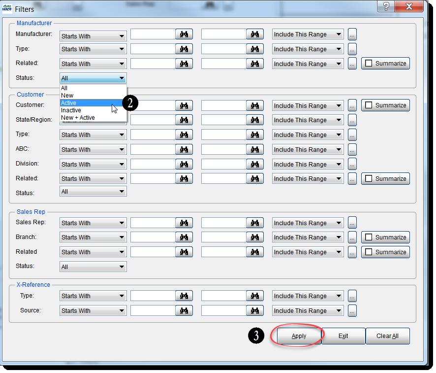
- From the Sales IQ screen select the Filter button.
- Select Active from the Manufacturer Status drop down list.
- Select the Apply button.
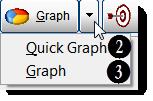
- From the Sales IQ screen with your selections displayed, click on the down arrow to the right of the Graph button and select Graph.
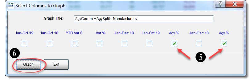
- Check the boxes for Jan-Aug 19 and Jan-Aug 18 in the Select Columns to Graph screen.
- Once you have made your selections click on the Graph button in the lower left hand corner of the screen.
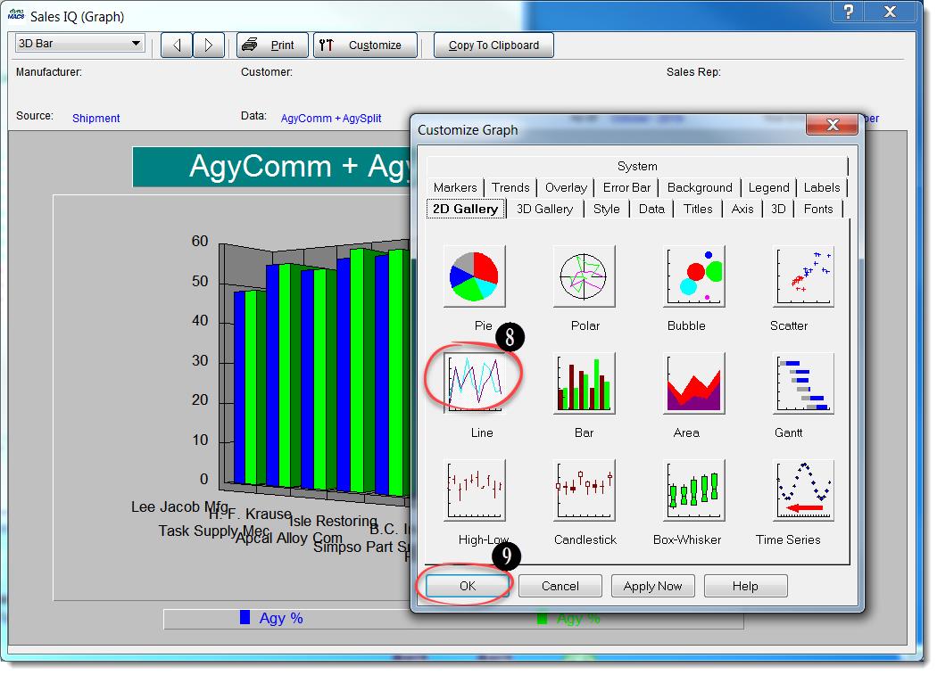
- The graph will default to a bar chart. Select the Customize button to change the type of graph that will appear.
- Select the Line chart (or Pie etc.) to customize the look of your graph.
- When you have completed your selections select the OK button.
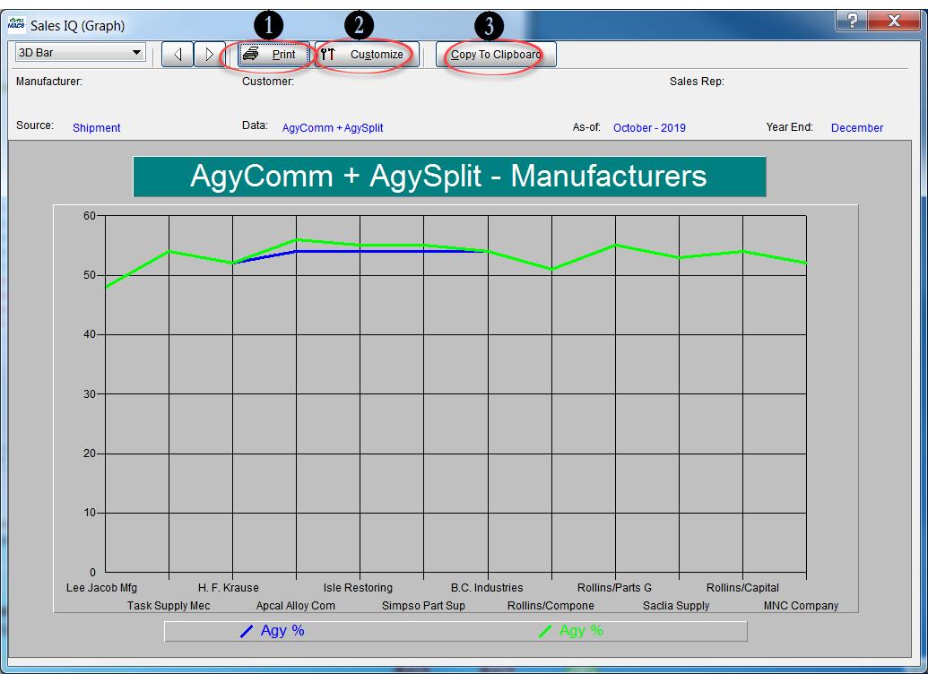
From the Sales IQ Graph screen you can:
- Print the graph.
- Customize the look of the graph.
- Copy to Clipboard.